
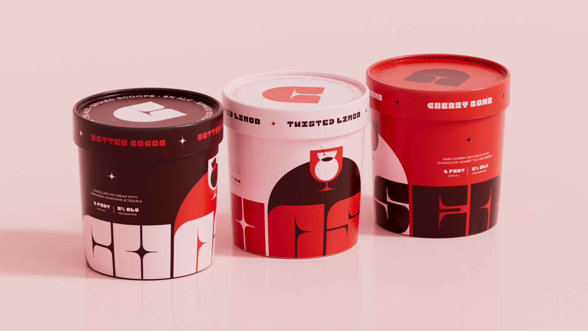
Chaser Spiked Scoops
A fearless, boozy ice cream brand that pushes boundaries and redefines what dessert can be.
BRAND STORYChaser Spiked Scoops blurs the line between two favorite vices, booze and dessert, serving ice cream with an edge. Bold, spiked, and unapologetically indulgent, each scoop challenges expectations and redefines what dessert can be.
Familiar flavors are pushed further through provocative pairings and unexpected depth, turning every bite into something layered and adult. Sweet meets heat. Cream meets kick.
Driven by a punchy visual language and irreverent tone, Chaser celebrates indulgence without apology. This is ice cream with an edge.
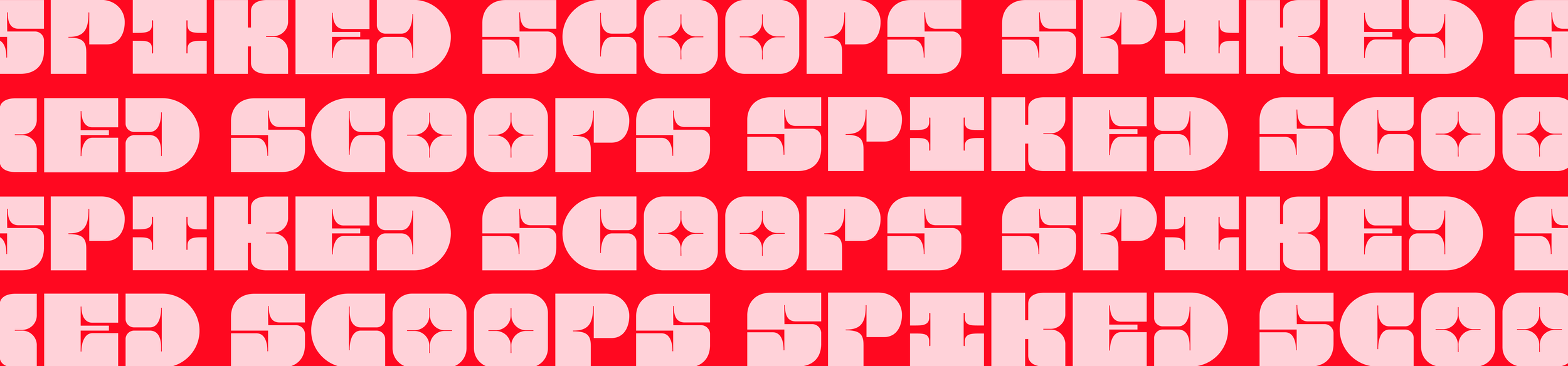
THE IDENTITYChaser’s identity is driven by a custom typeface built from the curves and structure of a cocktail glass. Letterforms stretch, flare, and cut with attitude, creating a mark that feels poured rather than printed.
The visual system follows suit. Bold color blocking, sharp contrasts, and punchy illustrations reinforce the brand’s irreverent tone. It is loud without being chaotic. Playful without being precious.
Every element is designed to carry the same energy as the product itself: strong, graphic, and unmistakably adult.
Brand Identity
Packaging Design
Motion Graphics
Experience Design
Typeface Design
VISUAL IDENTITY


PACKAGING DESIGNPunchy Pints
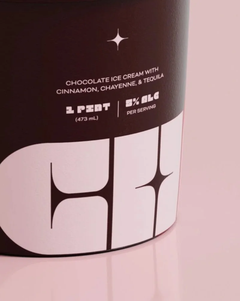
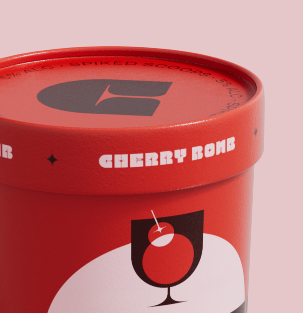
The pint lineup packs a punch. Provocative pairings and vibrant color blocking collide with oversized typography to command attention on shelf, while the cocktail glass stands as a symbol of celebration and vice.





FLAVOR RANGE


